You know the feeling. Walking into a restaurant, a shop, an office (sometimes, even the mall or the bank) and end up looking at their beautiful countertops and how they tie into the overall design. You wonder, how could you create the same aesthetic to appeal to your customers or clients?

Of course, countertops have top priority. For an eating place or an office, the counter space is the most important thing in the room. That’s where everything happens.
We’ve gathered some impressive examples of how counters are used in a commercial setting. Each of these designs is unique and beautiful, and each one showcases some pretty creative ways to make your counters the defining element.
A tale of two bakeries
So we don’t have the entire story behind these bakeries, instead, we have a couple of pictures and a lot of enthusiasm for their phenomenal design.
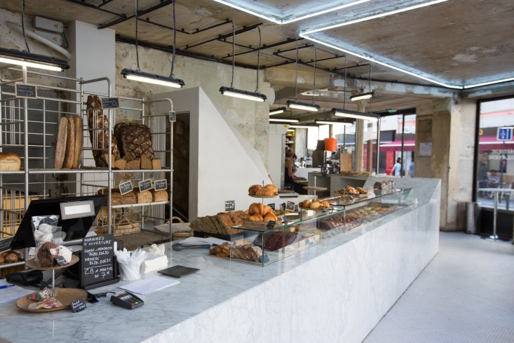
We’re traveling across the ocean for this one. This is the Liberté, a Parisian bakery. No American minimalism here! This shop embraces the aged beauty of the building and inserts some sleek, modern design at the same time. And it works! The modern, white-and-gray marble counter and the pops of bright color around the room – such as bright red stools – actually complement the centuries-old architecture. The blending of design is what gives this bakery a charm that is totally unique to itself.
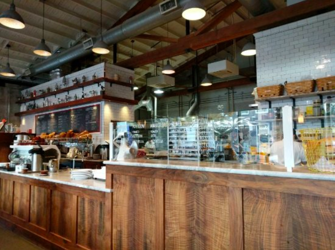
Back in America, we’re looking at Roman Candle Baking Co. in Portland, Oregon. The vaulted ceilings and industrial fixtures give this place a big, open feel. And the designers have used the space well. The boldness is toned down with dark wood elements and (especially) that almost-delicate looking stone countertop. That’s one thing you want to remember when choosing countertops: combine opposites. Opposites create interest. Contrasting elements are your best friends.
And while the countertop sits here unobtrusively, being made of stone means that it will last a long time. Stone is the perfect material to create durable commercial countertops that will see a lot of wear and tear.
A coffee shop that nails it aesthetically
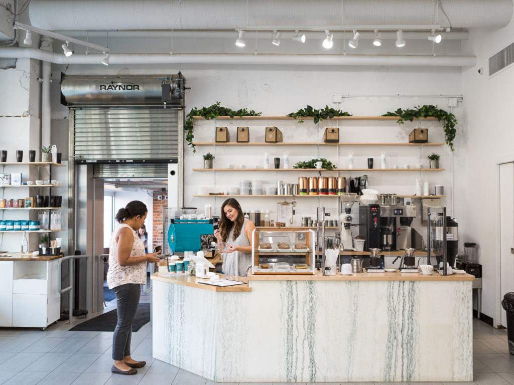
This adorable coffee shop in Flint, Michigan nails it in the texture department! With a toned-down, neutral color pallet, this place can handle the bold textures in the metal, brick wall, and the lovely white-and-gray stone counter. A design like this runs the risk of looking cold and sterile. But the wood countertop and matching shelves give it that little bit of natural color to offset the white and grey.
At the office
Although your dream job may be working in a smoothie shop or a Parisian bakery, there’s a large chance you’re part of the majority of American citizens who work in an office job. But don’t despair! Let’s look at a couple of ways you can give your office a face-lift. Remembering, of course, that counter space is the most important part!
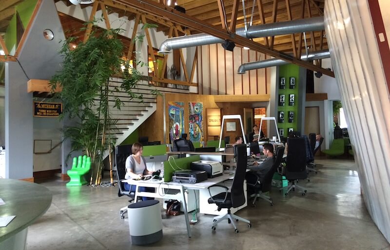
If your job requires that all those creative juices be flowing day in and day out, why not make it easy? Creativity doesn’t often come by staring at the wall. The wall needs to be interesting. Fill your space with inspiring things – relaxing chairs, big wall art, and rugs. Then give yourself a practical, durable place to work, and voila!
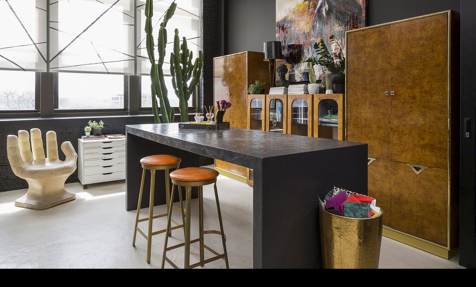
Studio Sven workshop office by Jacob Hand via Elle Decor
We love how this office space is dark and calming, bright and inspiring at the same time. And that dark stone waterfall desk! Don’t you just want to sit down and get some work done?
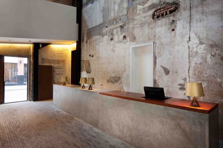
This funky counter is nothing short of incredible. Once again, the perfect blend of modern and rustic. The concrete reception desk is topped off with some bright cherry wood, upping its practicality and style.
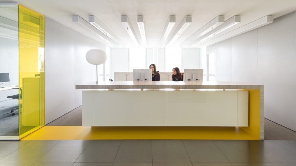
And then there’s the super-duper professional look. This reception desk is in Germany. The Germans certainly have modern tastes! This design is eye-catching, clean, and sharp. Plus the counter is just so unique.
Anything is possible
When it comes to stone countertops, anything is possible. You just have to get creative and have fun. With so many choices from funky, rustic, eclectic, modern, or retro, you get to choose: will you go with a tried and tested look? Or make up your own style, blending several elements together and creating a whole new trend? If you need more pointers, check out our article about creating a cohesive look using stone.

Recent Comments